| Seasonality |
There's apparently some interest in identifying weeks or months when a particular stock goes up (down?) so ...
>So you have a spreadsheet, right?
Well ... yes.

>What about those colours?
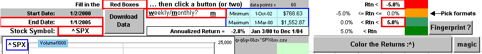
First you type in a stock symbol and click on Download Data. You'll get five years worth of weekly prices.
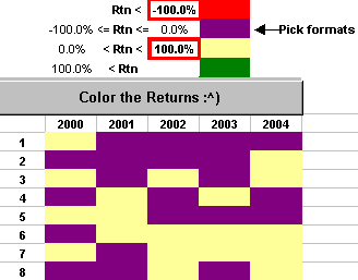
Then you click on the Color the Returns button and the weekly returns (for each year) get coloured
with negative returns one colour and positive another color (according to the formats you've selected).
'course, if you're just interested in the pattern, you can do this:
|
|
|


The slick colour patterns are like a fingerprint, eh? **
Here's the fingerprint for the S&P500 and the Nasdaq, with monthly colors over the past fifteen years.
Which is which?

|
|
|


>Fingerprint? How about StockPrint?
I've added a button for that, like so 
>And why just monthly data for the fingerprint? Why not ...?
I've added that too, like so 
And to get just colours, I've added a button called 
The top now looks like this:
>Okay ... is it colours or colors?
I give up ...

Almost forgot.
RIGHT-click on the picture of the spreadsheet and Save Target to download the spreadsheet.
(Or, depending upon your browser, just a plain left-click may work.)
See also seasonality
** and
Discussion Forum #1
and Discussion Forum #2
... where the neat coloured charts apparently originated 
See also Color the DOW