| Raff regression ... and trends |
|
Normally, when using regression analysis in the stock market, one looks at recent historical returns for some stock
(example: MSFT) to see how it compares to some "benchmark"
(example: S&P500) ... then determines a "best straight line" fit
(the "regression" line) as illustrated in Figure 1.
>Huh?
>The big dot with the arrow?
| 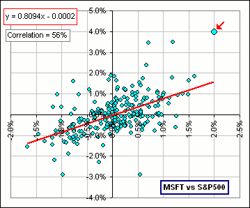 Figure 1 |
Hardly. That day was unusual. For the time period considered (about one year), the daily MSFT returns tended to be less than the S&P returns.
In fact, look at that "best line" equation: y = 0.8094x - 0.0002
It says that (roughly): MSFT returns = 0.8094 (S&P returns), or about 81% of S&P daily returns, so that ...
>And that's Raff regression?
No! Be patient ... I'm getting to that.
The thing to notice about Figure 1 is that both x- and y-axes denote returns.
One can also imagine a situation where the y-axis gives stock prices and the x-axis give time.
>Huh?
|
Consider Bollinger Bands, where, each day, we find the Average and
Standard Deviation (SD) of stock prices over the past 20 days (for example) and plot two points:
Average + 2*SD and Average - 2*SD and get something like Figure 2. >That's regression?
| 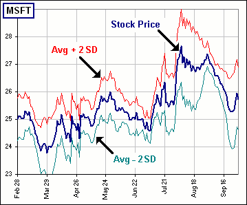 Figure 2 |
|
>That's where Raff regression comes in, right?
>That'll give ... uh, some kind of trend line?

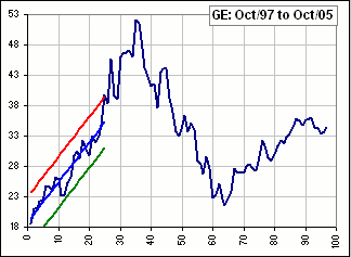
>And those coloured lines tell us ... what? | 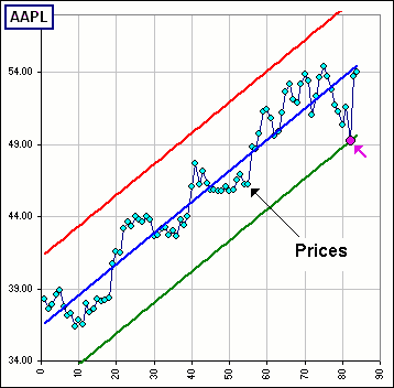 Figure 3 |
The Regression Channel Top will be the precise point at which the high days in a trend hit resistance and turn down,
and the low days will find support at the Regression Channel Bottom and turn up.
Finally, a day will arrive when price exceeds the Regression Channel Range and the trend is over.
>So, if the prices break out of the channel the trend is over?
According to Raff.
For example, if we look at the Channel for MSFT and see the prices break out above the top line then watch to see where MSFT goes then ...
>A picture is worth a thousand ...
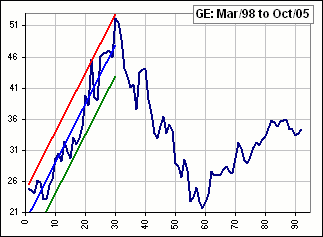
Okay, look at Figure 4.
>Wow! That's great! And that always happens?
Uh ... not always. In fact, it would appear that Raff expects the price to drop, not rise.
In Figure 4 the stock prices headed to the stars after breaking thu' the Top of the Channel.
(It appears that Raff expects them to turn back down after hitting the "top resistance" ... unless the prices "Break Out" of the Channel.)
Okay, so you get excited about a Break Out and Buy (or Sell) your stock but you might obtain (or miss) a nice Gain if, for example ...
|
>A picture is worth a thousand ...
Okay! If you Sell when the prices break thru' the Bottom of the Channel (expecting them to sink further), then you'd have missed some BIG XOM gains, like so: 
| 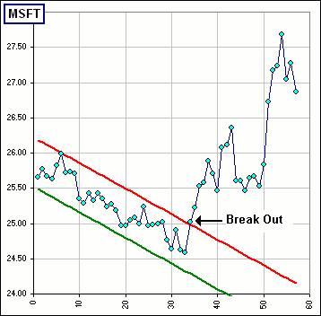 Figure 4 |
>But Raff says that prices have hit their "support" and would move UP ... so you'd Buy!
That's true, so if we follow Raff's advice, we'd Buy and get all them delicious XOM gains
... assuming we thought it was "support", not "Break Out".
>So Raff is right, right?
Sometimes ...
>So where's the spreadsheet?
Uh ... it looks like this:
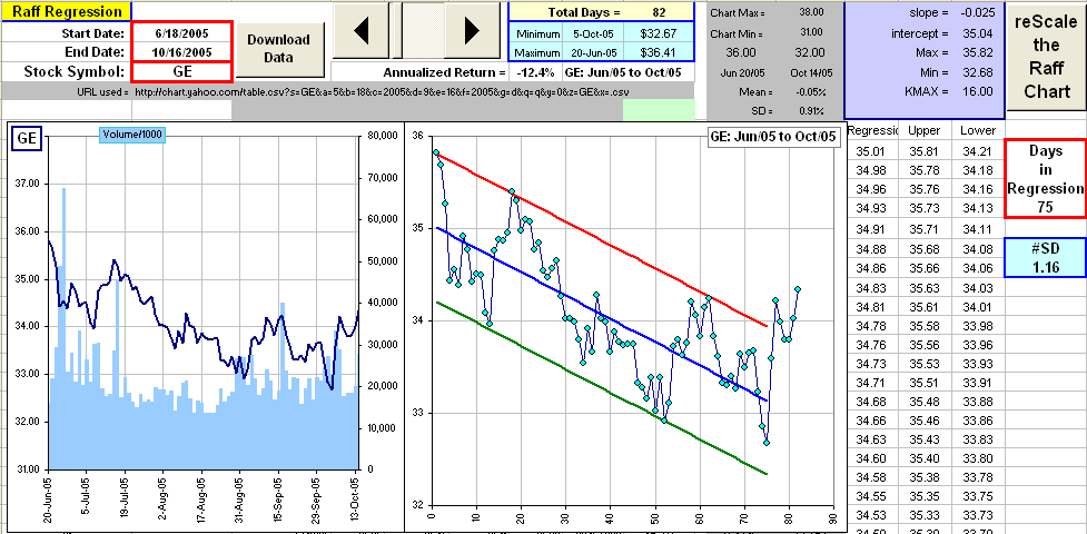
Click the picture to download the spreadsheet
Pick a stock, some dates, click a Download button, move those arrows right or left to move those
Top and Bottom lines UP and Down.
The number of Days downloaded is shown and you can base the regression on just the first few days ... if'n you want.
For example, the above picture shows 82 days downloaded, but the regression line involves just the first 75.
That's so you can see what happens next, hence investigate the efficacy ...
>Yeah, yeah. And the spreadsheet actually works?
Ain't you heard of my money-back guarantee? 
| Break Out ... and end-of-a-trend |
Here are some examples.
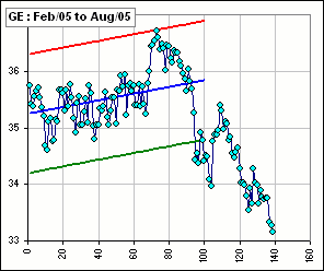
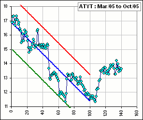
In each case, about 140 stock prices are downloaded, but the regression line is based upon the first 100 data points.
That way, you can imagine you're at that 100 day point, looking at the Channel and deciding what to do.
Then you can see what happens for the next month or so.


>So what does Raff do?
Play with the spreadsheet!

I guess that most traders would tend to sell near the top of the channel and buy near the bottom.
In other words, the support line is the bottom line - and the "bulls" won't let the price fall below it -
and the resistance line is the top line - and the "bears" will not let the price rise above it.
Then, of course, there are Break Outs. Indeed, I've read this:
A stock that breaks out above the top regression line within an uptrending channel
should be purchased on the first pullback that touches that line.
The odds suggest that this former resistance line is now support ...
| >So real money is to be made on them break outs.
I guess ... >You guess? So why don't you buy Raff's book?
>Picture?
>So what does Raff say?
|  Figure 5 |
Okay, there's an initial trend, then a break out at the top, then a return to the channel and a break out at the bottom and ...
>A picture is worth a thousand ...
Here are some pictures: