| Correlations ... a sorta continuation of 2 stocks |
We want to consider the possibility of generating random returns with prescribed parameters ... such as correlation.
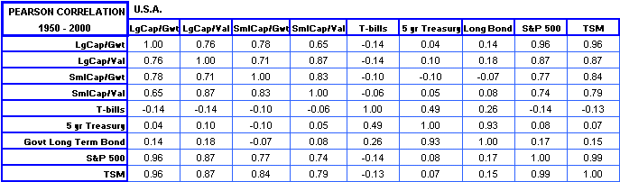
When one talks about the correlation between stock A and stock B, one usually means the Pearson correlation which would give, for example:
For example, if we look at the last five years of daily GE returns and wish to compare to the S&P500 returns we might get something like these distributions:
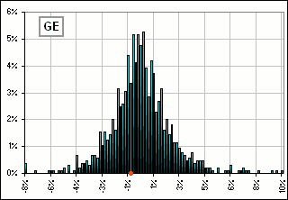 Figure 1A | 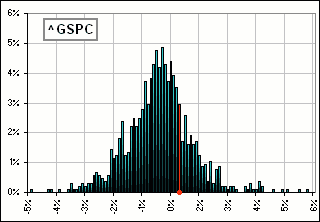 Figure 1B |
|
>Ta-Dum! ... and the correlation IS ... huh?
For these two sets, GE and S&P, it's about 78% and if we plot each of those returns as a point (x, y) = (S&P return, GE return) we'd get something like Figure 1. The interesting thing is, if we wanted to know if there were some underlying relationship between the two variables (here they're two sets of returns), then the Pearson correlation only tries to identify a linear relationship. That is, if y = Ax + B, the Pearson correlation between x and y would be equal to 1 ... or 100%. >That's Pearson correlation, but what about Spearman correlation
>Cupolas?
| 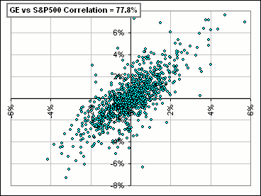 Figure 2 |
|
Note that if returns are related nonlinearly (for example), then ...
>Nonlinearly?
When one goes up or down the other is bound to go up or down in synchronism.
>Intimately and nonlinearly!
| 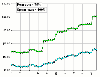 Figure 3 |
>Huh?
Spearman assigns to each stock return its rank, so:
- For stock A, if r1 is the 7th largest return in the set r1, r2 ... r50, then we write down 7.
- If r2 is the 27th largest return in the set r1, r2 ... r50, then we write down 27.
- etc. etc.
- If r50 is the 3rd largest return in the set r1, r2 ... r50, then we write down 3.
- We then discard the sequence of returns and retain the sequence of ranks for stock A: [7, 27, ... 3]
- We repeat, to obtain a sequence of ranks for stock B.
- Then we take the Pearson correlation of the two sets of ranks to get the Spearman correlation

>And that does ... what?
It's guaranteed to give 100% Spearman correlation if the stock A and stock B go up and down together.
In fact, the two sequences of ranks are identical (for our fictitious stocks A and B with returns
r and 100 r3), so the Pearson correlation of ranks is equal to 1 (or 100%).
In fact, if we can change the second set to any increasing function of the first set, the ranks hence the Spearman correlation is unchanged.
For example, if the second set is r3 or er or log(1+r) or ... whatever, the Pearson correlation remains unchanged.
|
>I don't see any copulas yet ...
We want to see the "correlation" between stocks, so here's what we can do: Remember Figure 1? It shows two separate distributions, and what fraction of returns lie in those wee intervals. We'd like - somehow - to put them both on the same distribution chart. We could, for example, combine Figures 1 and 2 to get Figure 3, where the separate distributions are shown ... as well as the plot of (S&P return, GE return). >That's a Cupola?
>Aha! You said Cupola! What does copula mean, by the way?
| 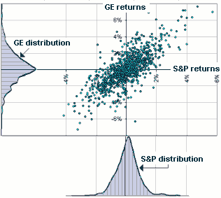 Figure 3 |

| Copulas |
Okay, notice one neat thing.
|
When we discarded the sequence of returns and retained the sequence of ranks, instead of getting a distribution like Figure 1, we get ...
>A distribution of ranks, right?
>Huh?
>Okay! Okay! I get it!
>There'd be 5 in each.
| 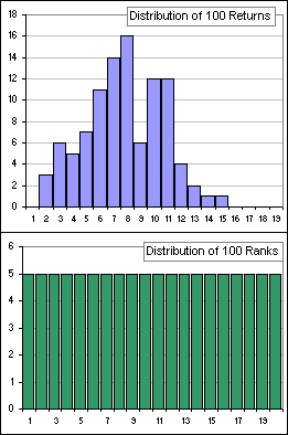 Figure 4 |
>Are we there yet?
Not quite, but we should go slowly because ...
>I'd be happier if you'd just define a copula!
| A copula is a probability distribution on a unit cube [0, 1]n for which every marginal distribution is uniform on the interval [0, 1] |
Happy now?
>No. Maybe you should go slow.
Okay. Notice that, in Figure 4, the bottom chart is a uniform distribution
... derived from a standard, garden variety distribution in the top chart.
That uniform distribution thing is the key.
Remember how we generate a standard, garden variety distribution from a uniform one?
>Are you kidding?
| 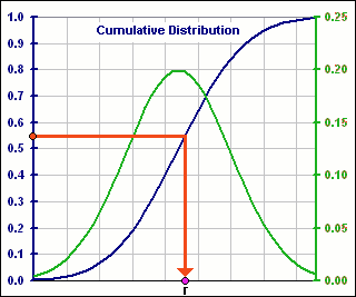 Figure 5 |
>But that green curve is a standard, garden variety distribution ... isn't it?
Yes, just like Figure 1A and 1B, except it's smooth because we invented a smooth blue curve.
The point to notice is that we:
- Start with some curve increasing from 0 to 1 (that's the blue curve).
- Select from a uniform distribution (the numbers selected at random on the vertical axis, like 5.5, above).
- Then generate our (final) distribution function (that's the green curve).
Well, two assets, like maybe stocks and bonds.
So our probem is to generate a distribution for each asset so these two distributions have prescribed Mean, Volatility and Correlation.
|
Then we'd like to generate something like Figure 6A, where x and y are random variables and, for each pair (x,y),
we have a probability that that pair will occur. The probability is given by the height of the surface.
>It gives the probability that the two variables are exactly x and y?
For example, if x = 1 and y = 2, then the height might be z = 0.05 so the probablility is 0.05 (or 5%)
| 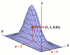 Figure 6A |
|
>And the x and y variables have what kind of distribution?
>And that's typical?
>But you always pick normal!
>Beta who?
>And in Figure 6B, which is normal and which is beta?
| 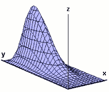 Figure 6B
|


| Constructing Copulas |
We'd like to construct a joint distribution (like Figure 6) with prescribed properties.
To do this, we can use the following:
- We invent a function C(x,y) which, for each pair x and y lying in [0,1], generates a number in [0,1].
- C(x,y) = 0 if either one of x or y is 0. (That is: C(0,y) = C(x,0) = 0 for x and y in [0,1].)
- C(x,1) = x and C(1,y) = y. (That is, for y = 1, C(x,1) = x increases from 0 to 1 as x increases from 0 to 1.)
- C(x,y) is increasing in both x and y. (Like the blue curve in Figure 5.)
|
Yes. The various requirements say that C must be increasing and what she's like along the boundaries of
the unit square 0 ≤ x ≤ 1, 0 ≤ y ≤1. >And that defines C?
The neat thing is that, having picked a Cupola, we can generate a joint distribution function for x and y
|  Figure 7 |
- Suppose the distribution functions for x and y are F1(x) and F2(y).
- Then C(F1(x), F2(y)) is a joint cumulative distribution function for x and y.
|
>Cumulative? You said it'd give something like Figure 6.
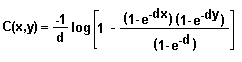
I lied. Figure 6 is the density distribution. C will give the 2-dimensional version of the blue curve in Figure 5 ... like Figure 8. >I assume you just invented Figure 8, right?
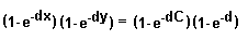
For example, C(x,1) = (-1/d) log(e-dx) = x. >What's that "d"?
| 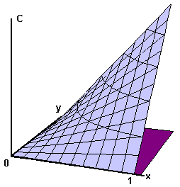 Figure 8 |
 |
>I assume it has a name?
Yes, it's Frank's Copula, named after M.J. Frank (who introduced it in 1979).
>Are there others?
Well, there's Clayton Copulas and Gumbel with various types that go by the name of Gaussian or Archimedian
(Frank's is Archimedean) and ...
>Yeah, thanks. Can we stop now?
No ...
 for Part II

)