| Stock Ellipses |
I got email from Ron McEwan about generating ellipses that contain points in a scatter plot where ...
>Wait! What are you talking about?
Okay, we do this:
Okay, let's do this:
| 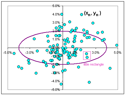 Fig. 1 Ellipse and scatter plot |
|
If the returns have a normal distribution, then each set of x- and y-values has Mean = 0
and, let's say, Standard Deviations Sx and Sy.
Then there's a probability of finding the x-value between x and x + dx given by the magic formula >Rectangle?
>I really think that ... |
|
Okay, knowing the probability of the horizontal value being in a wee interval at x and the vertical value being in a wee interval about y, the probability of finding a point in a wee rectangle at (x,y) should be (using the magic formula in Fig 2) proportional to:
| For sanitary reasons, we'll let Sx = a and Sy = b so we get: |
|
>You just multiply the probabilities, right?
Yes, that's what I've done.
|
Then there are curves where the probability is constant, namely ... >Don't tell me! They're the curves (x/a)2 + (y/b)2 = constant.
>Don't tell me! They're ellipses.
>And the significance of that is ... what?
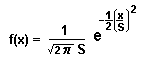
| 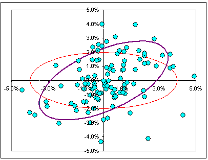 Fig. 3 A rotated ellipse |

|
Let's look at a real, live scatter plot, say GE versus the DOW Fig. 4 show the relationship between the daily returns, over the past year. See the four wee rectangles? According to the above prescription, we should associate with each the same probability, but we see that ... >But the rectangles in the 2nd and 4th quadrant don't have too many points. In fact, the points seem to ...
So, if the returns are not independent, but somehow tend to be linearly related (as implied by their hugging the regression line), then the prescription above for the probability of finding a point in a wee rectangle needs to be modified. Indeed, if we have a randomly selected x-value, the corresponding y-value is likely to be close to that regression line.
|  Fig. 4 GE returns vs DOW returns |
Patience. By the way, if you want to see a scatter plot where the returns really hug the regression line, check this out:

Okay, we'll study Bayes Theorem. It gives us the probability of getting a particular pair (x,y) if y depends (in some way) upon x.
We'll call P[x] the probability of getting a particular x-value. (Actually, P[x] will be the probability of getting a value in some wee interval about x.)
The probability of getting a particular y-value given that x-value is (according to Bayes):
| [A] P[x and y] = P[x] P[y, given x] |
| [B] P[x] is proportional to e-(1/2) (x/a)2 |
To get P[y, given x] we have to stare carefully at the distribution of y-values for a given x-value. (Remember the tall, skinny rectangle?)
Since we're doing the math snow-job thing (by assuming normal distributions for
(Them's the y-values in the tall, skinny rectangle in Fig. 4 ... distributed about the value mx + k).
That is, the probability P[y, given x] looks like what's in Fig. 2, with x replaced by y - mx - k:
| [C] P[y, given x] is proportional to e-(1/2) {(y - mx - k)/c}2 where c is the standard deviation associated with the distribution of y-values for a given x-value. |
|
>Huh? Replace y by y - (mx + k)? Can you do that?
In Fig. 2, the variable x appears all by itself 'cause its mean is 0. In general (for a non-zero mean), we'd have this | 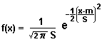 |
In our investigation of the distribution of y-values, given x, the Mean value of the y-values is assumed to be (mx + k).
>Can you do that?
This is mathmanship, remember?
Now we plug [B] and [C] into [A] and get something that looks like this:
| [D] P[x and y] is proportional to e-(1/2) (x/a)2e-(1/2) {(y - mx - k)/c}2 |
They're tied up in the values of m and k. Just wait until we're finished, okay? All will become clear.
>I doubt it!
Okay, we stare at [D] and see that the curves of constant probability look like:
>Aha! That's a rotated ellipse, right?
|  Fig. 5a (x/a)2 + {(y - mx - k)/c}2 = 1 with varying m |  Fig. 5b GE and DOW and an ellipse |


|
>Okay, but you said that the y-values are normally distributed ... in that tall, skinny rectangle. Is that true?
You kidding? Of course it's true! Take a look at the daily returns on GE over the past 8 years, when the DOW had returns between 1.0% and 1.5%.
|  Fig. 6 GE distribution |

Click on the picture:

>Uh ... is it useful?
How would I know?