| Portfolio Evolution |
|
One thing that I find fascinating is the variablility of future estimates of portfolio evolution, where you randomly select annual returns from historical data and ...
>And see what happens, compared to what actually happened, right?
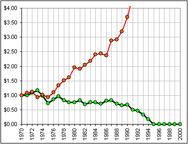
Here the green graph is the actual portfolio evolution, starting with $1.00 in 1970 and continuing for 30 years.
>Uh ... what portfolio? Just the S&P500 or maybe ...
|  |
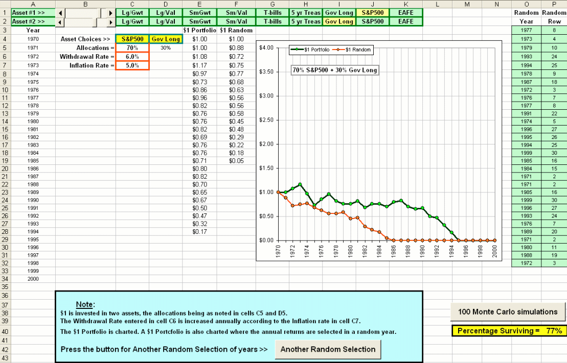
You choose a couple of assets (by moving the sliders: for example S&P500 + Gov. Long Bonds)
and the allocations and some withdrawal rate (in case you're withdrawing) and some inflation rate which is applied to the withdrawals.
Every time you click on a button you get Another Random Selection of yearly returns ... so you can compare with an actual $1 portfolio.
There's also another button which, when pressed, will do 100 of these random 30-year selections and tell you how many survived.
>And I click on the picture top download the spreadsheet?
Yes, as usual.