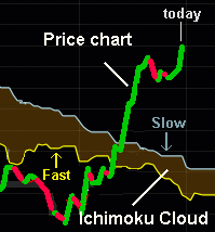
| Ichimoku Cloud |
I've been investigating all this Technical Analysis stuff for years (and years).
I even generated a bunch of tutorials and spreadsheets.
>And you can't remember any of them, right?
Pay attention.
I thought I had at least heard of most technical indicators, like Bollinger Bands, Aroon indicator, ADX, Williams %R, etc. etc.
Then I run across something called the Ichimoku Cloud
Although it's based upon simple moving averages (and we've all seen them before), it shifts some of these into the future.
|
>You're kidding!
No, the curves that define the "cloud" continue for about a month into the future -- beyond today's price. See? >I see. It's some kind of crystal ball that forecasts ...
|  |
The other cloud boundary considers 2 simple moving averages, for N = 9 and N = 26.
In each case, the Maximum High and the Minimum Low are averaged (over the past N=9 and N = 26 days).
This gives a point which, again, is plotted 26 days into the future!
Between these two curves ... that's the Ichimoku Cloud ... or Kumo.
The curve based upon N = 52 moves more slowly than the curve based upon N = 9 and 26.
>Why the Highest High and Lowest Low? Why not just simple moving averages of, say, closing prices?
Aah, yes, that's the fascinating part of this scheme.
The scheme was originally developed by Goichi Hosada (years before World War II), a newspaper journalist, and published in 1968.
I guess his idea was to capture previous "irrational exuberance" by considering the Highest High and the depths of investor depression (hence the Lowest Low).
These would could should give an indication of where prices might go -- in the future.
|
Look carefully at the Max High and Min Low curves.
For GE, they'd look like this (for N = 9 days): Note that they move along at a constant value until they run across a bigger High or a smaller Low (over the past N = 9 days). I imagine Goichi Hosada saying 
>Huh? Them Max High and Min Low curves look like the future. >Because they're to the right of the stock prices? Exactly! Remember, Hosada wasn't a financial guru. If these curves look shifted to the right, maybe they foretell the machinations of the stock prices. If we look at N = 26, this "future" shift is more evident: 
| 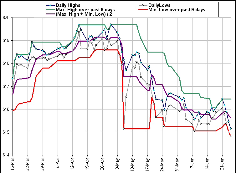 |
The purple curve? That's half way between Max High and Min Low. In other words, it's their average.
|
>Yeah, but where's the cloud?
Patience ... but here's one just for you: |  |
I'm working on it. It's a struggle to get all them time-shifted lines and coloured areas and ...
>Just show me the spreadsheet.