| Colouring things |
Once upon a time I worked up a spreadsheet where you could, for example,
color the DOW.
I ran across that spreadsheet yesterday and was delighted by the pretty pictures is generated.
|
>Huh? Color the DOW?
Yeah. You download a bunch of data and generate a picture like Figure 1. It shows the weekly returns, week-by-week, over five years and the colours indicate how often they occur. >So?
| 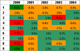 Figure 1 |
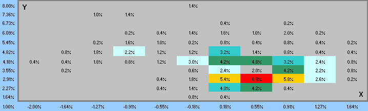
Figure 2
>What are those numbers ... in the coloured cells?
They're the frequency with which that combination (X,Y) occurred.
For example, in the red cell it says 6.8%. That means ...
>That combination occurred 6.8% of the time?
Yes, how often ... during that particular 10-year time period.
>Is that useful? I mean, how often would I want to know how often ...?
Well, there are lots of things that can be calculated when the return and volatility are known, like the
Sharpe Ratio.
So, if pick some risk-free rate, say Rf, and you know how often (X,Y) occurs, you also know how often (X -Rf) / Y occurs.
>I assume there's a ...
A spreadsheet? Yes:

| You can pick the colour for each range of percentages, like so And you can choose to display the Z-values or just how often (X,Y) occurs. | 
|
>I can stick in my own formula for Z?
Yes. It can be any function of X, Y and a risk-free rate Rf.
For Rf, you type in an annual rate and the spreadsheet changes it to a weekly or monthly rate and ...
>And I click on the picture to get the spreadsheet, right?
Right. Or you can RIGHT-click and Save the target file.
>And it's very useful, right?
No, I said it's very pretty.