| Stocks vs Bonds and Risk : Part III a continuation of Part II (Stocks vs Bonds and Volatility) |
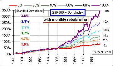 Fig. 1 |
We continue our study of a portfolio with both Bonds (represented by a Mutual Fund which
tracks the Lehman Bros. Aggregate Bond Index) and stocks (represented by the Standard and
Poor's 500 Index) over a ten year period ending in December, 1999. The Standard Deviation (or Volatility) increases* as we increase the fraction of stocks as indicated in Fig. 1 where the growth of our portfolio is portrayed. * Note that, adding 20% stocks to an original all-bond portfolio has decreased the Volatility (from 1.9% to 1.7%).
|
Good point. In fact, if your annual returns oscillate violently between 50% and 100%, you'd be ecstatic ... even if the volatility is great. So let's consider Risk versus Stock Fraction.
>Why do you colour "Risk", in green?
To distinguish it from Risk-as-Volatility: see Risk bumpf.
|
>In Fig. 1, it looks like it took five years for stocks to beat bonds.
Yes, the early 1990s were good to the Bond Fund. After that, stocks took off. Here are those first five years:
Note that even 40% stocks gave a lower Volatility than an all-bond portfolio
(1.8% compared to
2.0%). And an all-stock portfolio, although having the highest
Volatility (3.5%), gave the worst performance:
7.4% annualized return vs 8.1% for all bonds. |
 Fig. 1a |
|
>Risk ... what about risk? We'll define Risk in terms of portfolio losses, or negative returns. How often would we have had a negative return, say -1%, in the months covered by Fig. 1? Ten years worth of months. What about -2%? How often? Or maybe just "How often would there have been any loss?" And how might we have changed that number by increasing or decreasing the stock content?
Here's a picture: |  Fig. 2 |
Now consider the red curve. It's saying:
If we had decreased our Stock Fraction (100% to 40%), we'd have had a greater
number of months with a gain exceeding -2%.
In fact, with 40% stocks, about 95% of the months had a Monthly Return greater than -2%.
All curves suggest a Stock Fraction smaller than 100% ... if we're afraid of losses of 1% or 2%.
Now consider the blue curve. It's saying:
The number of times that we'd have achieved a positive gain (p = 0%)
tends to increase with an increase in Stock Fraction
... but not dramatically.
>I think the chart is a mite confusing.
Okay, look at the 60% Stock Fraction (where the dots are a little bigger). Just under
70% of the time
the monthly gains were greater than 0%. Just over
80% of the time they were greater -1% and just over
90% of the time they exceeded -2%. Clear?
>I suppose it also says that if "Risk" means losing ... losing ANYTHING
.... then maybe we should be looking at the blue curve.
I'd say it depends upon the individual. Some people want monthly returns that hardly ever go negative,
even if, after umpteen years, their portfolio isn't that great. At least they can sleep at
night. However, if they're willing to put up with more negative returns in order to achieve
a larger portfolio over the long haul, then more stock may be in order.
>How would I know what to choose?
Pick a number between "1" and "10" 
 Fig. 3 |
>You've been talking about the ten years from 1990 to 1999 and stocks
did pretty well during the last five of those ... Right! So let's consider just the first five years when bonds did better. According to Fig. 3 the Risk goes down at first (as you add some stock to an all-bond portfolio) then increases then ... >Okay, okay, I can see what's happening, but what about the "best" combination of stocks and bonds - an "optimal" fraction of stocks which ... Good idea! Let's minimize Risk per unit of Gain Factor ... |
|
>Wait! Maybe that lack of a trend - it's just for those five years.
Nope. Even for the ten year period (all of the 1990s) there was no clear trend as Fig. 4 shows: We plot the Percentage of losing months vs the Annualized Gain vs the Percentage of stock. Although the 10-year annualized gain was highest for an all-stock portfolio (about 16% compared to an all-bond portfolio with an annualized gain of 6.1%), the Risk was lower.
>You're defining Risk as the percentage of losing months? |
 Fig. 4 |
|
>Remind me - what's the Gain Factor and how does it differ from just plain Jane Gain?
Gain Factor is the total gain over umpteen months. Here, we're considering 120 months or ten years.
In fact, it's what $1.00 grows to, after umpteen years. If $1.00 grows to $2.34 the Gain factor
is 2.34 and if it grows to ...
Here's a chart of our Risk/GainFactor |  Fig. 5 |
 Fig. 6 |
>How about withdrawing 8% of the portfolio, each year? If we start with $100K and withdraw just 8% of what's in there - on a monthly basis - we'd get the chart at the left. >Do you have some formula which says whether some stock fraction is best, for ...? No, but ... >Are you recommending 100% stocks? Me? Recommend? No, I just analyze, plot graphs, write tutorials, sleep a lot, drink coffee. However, look again at Fig. 4. Even if we made positive gains 99% of the time that won't give you that warm feeling if the 1% of the time when you made negative gains ... they were HUGE. |
|
We have to consider the SIZE of those negative gains, factoring that into our analysis
... somehow. We have to identify some reasonable Risk Measure which will suggest
what portion of our portolio should be in stocks, what in bonds. Some Measure
that people will agree is indicative of ... of something, but what? Maybe we should overweight
negative gains, make them twice as important, twice as punishing. Maybe we should multiply every negative monthly
gain by, say, 2.
If we do that for our S&P500 + BondIndexFund portfolio, we get >zzz ZZZ |  Fig. 7 |
 to be continued ... one-of-these-days.
(Or y'all may want to check out Modern Portfolio Theory
to be continued ... one-of-these-days.
(Or y'all may want to check out Modern Portfolio Theory
See also: Stock/Bond Ratio