| Safe Withdrawal Rates and Monte Carlo ... continuing from Part I |
We're following K investors for N years.
They start together and invest in the same stocks (with prescribed return distribution) for N years.
They all start with the same withdrawal rate, the withdrawal amount increasing with inflation (which we assume is fixed).
They all withdraw at some (initial) rate that (hopefully) will last N years.
Here are our labels:
|
Mn[p] is the Monte Carlo withdrawal rate which gives a p% probability of surviving n years.
A(n) is the withdrawal amount at year n (n = 1, 2, 3, ... N) (It starts at some amount, increases with inflation and is the same for all investors.) Pj(n) is the size of portfolio at year n for investor #j (j = 1, 2, 3, ... K) Wj(n) is the current withdrawal rate, at year n, for investor #j (j = 1, 2, 3, ... K) so Wj(n) = A(n)/Pj(n) FN(n) is the fraction of our K investors that survive to year n. |
>So if we follow them for 30 years, then we're talking about N = 30 and F30(n), right?
Right, and here's a sample set of charts, following investor #123, where we assume parameters:
Initial Portfolio = $1M
A normal distribution of annual returns with Mean = 10%, Standard Deviation = 20%
Inflation Rate = 3%
Initial Withdrawal Rate = 4% ... thereafter, the withdrawal amounts increase at 3% per year
Then, at year n:
His Portfolio is P(n) with a random set of returns
His withdrawal amount is A(n) $40K increasing at 3%
His current withdrawal rate is W(n) = A(n)/P(n) ... also random

>But what if somebuddy's portfolio doesn't survive for 40 years?
It'd look like this:

Here, after 31 years, there's not enough portfolio left to accommodate the required withdrawal dollars (about $100K).
The withdrawal rate goes to infinity.
>That investor is dead, eh?
I wouldn't put it that way, but yes. He's out working again.
|
Okay, here's what we'll do.
Suppose all our investors buy 10,000 shares of stock worth $10. After one year the distribution of stock prices is like Figure 1a. Each investor will get one of these stock prices, with many getting prices near $10 ... >Like Figure 1a.
>But 1b looks like 1a.
Now they all withdraw, say, 4% of the orginal $100K. That's $4K.
>4%, increased by a year's inflation?
>That looks like Figure 1b.
>I get it! You just look at the 1-year stock price distribution, relabel the axis then ...
>And you do this again and again, right?
|
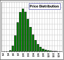 Figure 1a 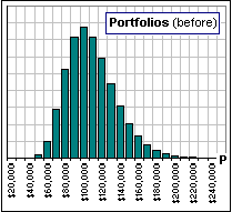 Figure 1b 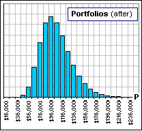 Figure 1c |
Yes, with negative portfolios. Well, actually, they're portfolios worth $0.
>Aaah ... they're the dead guys.
Yes, so here's what we do, each year.
- Look at the surviving portfolios only.
- Apply a random set of annual returns to these survivors (distributed as in Figure 1a).
- Subtract the current inflation-adjusted withdrawal amount
(based upon the initial portfolios and common to all investors, even though their portfolios differ). - Repeat steps 1, 2 and 3.
Have 95% survived?
|
Yes, but when that occurs, we have fewer investors still buying that stock, fewer surviving portfolios, fewer investors, so ... >Bury them!
|
 Figure 1d |
|
>But some still have $100K ... or more!
>That's the question, but what's the answer?
>And Figure 1d?
|

 1
1