| Pairs Trading |
Suppose we could identify two stocks that have a close relationship, historically speaking. Then ...
>Huh? A close relationship?
Suppose the prices behaved like stocks A and B, in Figure 1.
>Yeah, they look close enough, but how do you measure "close"?
Well, we could plot B vs A prices, like Figure 2, where each point is (A-price, B-price).
This scatter plot gives a regression line (the "best" line fit to the points, in red):
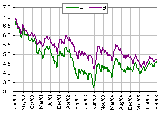 Figure 1 | 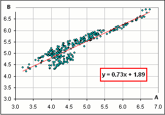 Figure 2 |
We might use Pearson correlation (which happens to be about 93% for these two price sequences), or maybe the Spearman Rank correlation (about 86%).
Recall that, with Spearman, we calculate the Rank of each price. There are about 300 prices represented for each of A and B in the above charts, so we
assign to each price its Rank among the 300 prices. For example, the Ranks for the each of the A-prices
(as time marches on) are shown in Figure 3:
The relationship between the A- and B-ranks is shown in Figure 4.
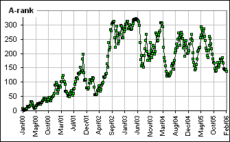 Figure 3 |  Figure 4 |
>And that correlation is ... what?
I told you already! It's about 86%.
>I assume the above stocks are fictitious, eh?
Well, to get a pair of highly correlated numbers I picked the weekly yields on 10-year and 20-year treasuries. 
In general, however, you might look at pairs of stocks within the same industry that are expected to move together.
>Historically speaking.
Yes. Then, when we see some significant deviation from that pattern, we bet on the close relationship being established again ... soon.
>What about stocks instead of treasuries?.
Here are some examples of "close" Spearman relationships between weekly prices over a 5-year period:


>And you can make money with this stuff?
Well, Jesse Livermore apparently looked at sister stocks that tend to move in the same direction, with perhaps a "leader" which the others follow.
>And if they move simultaneously?
|
That's the idea behind Pairs Trading. You see a strong correlation between X and Y.
Then - poof! - one day there's a significant deviation (the red dot, in Figure 5). You expect a reversion to the regression line (drawn in red in Figure 5). So you'll expect one stock to decrease and/or the other to increase so you short one and buy the other. >Which? Patience. >How much of a deviation before you do the pairs thing? Patience! >So where's the spreadsheet, so I can make those charts? A Spearman spreadsheet is described here. | 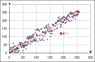 Figure 5 |
That's one way. You might also look at the Rank correlation between prices instead of between returns. In that case, we might look at
[*] (Price - Mean)/(Standard Deviation of Prices)
where the Mean and Standard Deviation are calculated from the Prices taken over the past umpteen weeks (or days or months).
>Using the Rank correlation between Prices?
Yes, normalized as in [*] so we're actually looking at the deviation of Prices from their historical Mean, measured in Standard Deviations.
We might also look at the Price Ratio between two stocks. (See Investopedia.)
Or, mayber, we might consider the Price Difference between our two stocks, or maybe ...
>Okay, I get it. How one identifies "sister stocks" is up to you.
Not me! It's up to you. 
One important characteristic of this pairs stuff is that it's "market neutral". You're supposed to make money whether the market goes up or down.
Of course, sister stocks that have a historical relationship may not exhibit that behaviour in the future. That's your risk.
>Not mine, yours! Anyway, where's the pairs spreadsheet?
Patience ...
 to continue