| Bollinger Band Stuff |
|
Ever since I started writing these tutorials I've been fascinated by Bollinger Bands and ...
>Because you've made money using them?
Remember when we talked about daily stock returns?
>So the daily returns bounce between those two limits: Mean[returns] ± 2*StandardDeviation[returns], right?
| 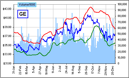 Figure 1 |
It's often a reasonable approximation to assume Normal or Lognormal.
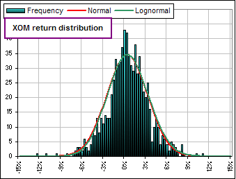
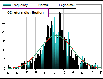
For example, consider the frequency of weekly returns over the past fifteen years for EXXON, GE and the DOW:

Okay, so if we think that stock Prices behave in a simlar way, then we might consider the two limits:
Mean[prices] ± 2*StandardDeviation[prices].
Them's the Bollinger Bands, tho' you might pick something other than 2.
>And are prices normally distributed?
Uh ... unlikely:

>So if you DO assume they're normally distributed, how do you calculate the Mean of all possible prices?
Uh ... you don't.
In fact, even with stock returns, you might look at the last umpteen days worth of daily returns and calculate Mean[returns] and StandardDeviation[returns],
then pray that the future is similar to the (recent) past. So we pick some number of days, like maybe 20 days, and calculate the Mean and StandardDeviation of these 20 prices and ...
>And generate a couple of Bollinger Bands, eh?
Exactly. In fact, the chart (Figure 1) above uses the previous 20 days, so we can see that ...
>Why are we doing this again?
If you let me finish you'd find out!
Let's write the Bolli Bands like so:
[1] B = Mean[Pn] + k*SD[Pn]
... where [Pn] refers to N recent prices: P1, P2, ... PN and SD stands for Standard Deviation.
>So, for 20 days, we got N = 20?
Yes, and notice that k = ±2.
Now let's divide both sides of [1] by Mean[prices]. That'd give:
[2] B/ Mean[prices] = 1 + k*SD[Pn] / Mean[prices]
For sanitary reasons, I'd like to refer to Mean[prices] as Pavg, in which case we can rewrite this as:
[2a] B/Pavg = 1 + k*SD[Pn] / Pavg
It's the case that SD[Pn] / Pavg = SD[Pn/ Pavg]. That is, we can calculate the Standard Deviation of the Ratio:
Price/Pavg.
Indeed, we can forget the N actual prices and consider all prices (for the past N = 20 days) divided by the Average over that 20-day period.
[3] B = 1 + k*SD[pn]
where pn refers to the N = 20 "normalized" prices
(each is divided by their Average)
and SD[pn] is the Standard Deviation of those normalized prices.
Since pn is a ratio of prices, these bands are much like the Bolli-limits when you consider returns.
That is, with returns we calculate the Mean and Standard Deviation of the daily gains: Pn / Pn-1.
With these normalized Bolli-bands we calculate the Mean and Standard Deviation of: Pn / Pavg.
|
>And k can be +2 or -2.
Or any favourite number ... whatever turns you on. 
Here's a plot for k = ± 2 and N = 20 In this chart, we've actually subtracted 1 and used: [3a] B = ± 2*SD[pn]
expressed as a percentage.
The horizontal axis represents the Mean of the N = 20 prices and the blue graph shows the normalized prices.
>And what's the advantage of these so-called "normalized" bands? Unless they provide more ...
>zzzZZZ | 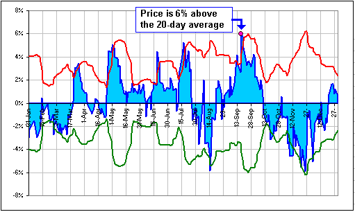 |
If you'd like to see these normalized Bolli-bands, there's a spreadsheet; click on the picture to download:
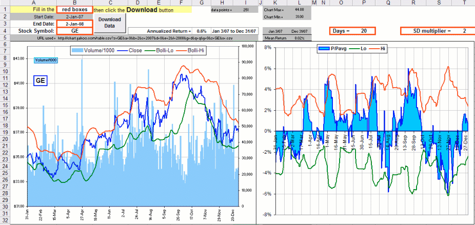
See the normalized prices and Bolli-bands, on the right?
>zzzZZZ